
Do you ever have trouble reading text in a document or on a website because there’s not enough contrast between the background and the color of the text? Do you find that the font style or the size is difficult to read? Does colored text or bolding help you to discern what is important in content? Let’s chat about what you can do to improve color contrast and what is an ineffective use of color.
- Ample Color Contrast
- Using Color to Communicate Information
- Using colors in different tools
Ample Color Contrast
Let’s begin with color contrast. It is essential that appropriate contrast exists between the text (foreground) and the background. In general, lightly colored text should have a darker background, and darkly colored text should have a light background. This also includes text on images, icons, and buttons. Also, colors used to convey information on diagrams, maps, and other types of images must be distinguishable.
Here’s a short video about the benefits of color contrast and you can always learn more at the W3C website (opens in a new window).
When we talk about color, we talk about three different things:
- Hue (red, green, blue)
- Saturation (pastel, bold)
- Brightness (closer to white, closer to black)
When it comes to accessibility, it is important to remember that only brightness is visible to all users. Changes in hue and saturation may not be apparent to readers who are color blind or have low vision and may disappear entirely when viewed in grayscale on devices with “digital wellness” settings that desaturate the screen in the evening.
The maximum contrast is black vs. white but other options are available such as navy/white, cream/dark brown, yellow/black, and similar color schemes. Generally speaking, a color scheme is considered legible if it can be read in grayscale/black and white mode.
Best Practices
- Make sure selected colors for fonts and graphic elements have a lot of contrast against their background.
- When using colors to differentiate between things (e.g., different parts of a chart or a link and its surrounding text), do not rely on color alone to differentiate elements between the two elements. Learn more about this in the “Using Color to Communicate Information” section below.
- When choosing colors to present text information in documents, choose color options that provide a contrast ratio of 4.5:1 for regular text; 3:1 for 18 point font and larger; or 14 point font and bold.
These screen examples show contrast ratios and examples.


- Use an automatic color checker like the Deque Color Contrast Analyzer, the WebAim Contrast Checker, Accessibility Color Wheel (opens in new windows)to assure you have been successful in your color selections.*
* In the Brightspace HTML (content) editor the color selector includes a color ratio check. Please refer to the section on Brightspace for more details.
Using Color to Communicate Information
Next, let’s chat about using color to communicate information. Relying on color alone to communicate information causes barriers to access for many readers: colorblind and low vision users may not be able to perceive the color differences, and screen readers do not announce colors to non-sighted readers. Therefore it is important to avoid using color alone to communicate information.
For example, if the link text is blue, it should also be underlined so users who are unable to perceive color differences can distinguish links from surrounding text.
Best Practices
- Have a secondary indicator that text is linked: not just another color, but also underlined, bold, or placed on a color background.
- When differentiating elements in charts and graphs, do not just change the color, but also change shapes, patterns, or the like, or provide some other visual differentiation like direct segment labels.
- Provide a text alternative for very complicated charts and graphics.

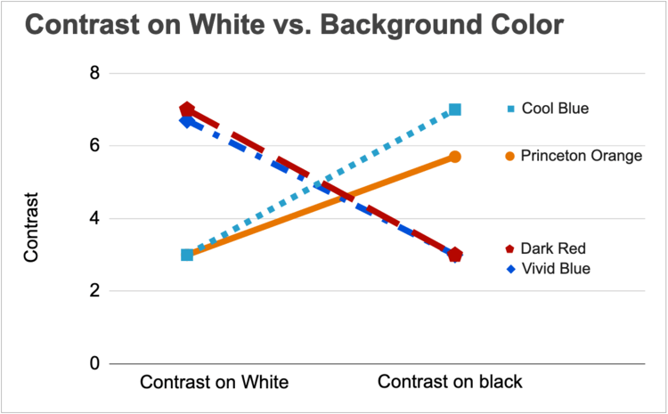
Notice that Graph 2 has different patterns for each line in addition to different colors to differentiate between the two colors of blues. Make sure to label each line.
Using colors in different tools
Brightspace
A Contrast Ratio checker is built into the Select a Color option in the HTML Editor.

Type your text and then select a color. As you click on different font colors, the Contrast Ratio numbers will change to indicate the amount of contrast between the font color (foreground color) and the background color.
Here is a screenshot of examples with 2 different colors with ample color contrast and 1 without minimum color contrast.

The green checkmark indicates that AA WCAG (Web Content Accessibility Guidelines) standards are met with a minimum ratio of 4.5:1 for small text and 3:1 for larger text.


The red circle with an “X” indicates that the color selection does not meet the AA WCAG standards. You will need to adjust the color which can be done by moving the slider to the right or by choosing a different color entirely.

In addition to this method of testing for color contrast, there is an accessibility checker built into the HTML Editor that will check the content for any accessibility issues. This includes identifying color contrast errors. Click on the accessibility checker and a pop-up will appear identifying any accessibility issues in the content if they exist.
The accessibility checker icon looks like an eye with checkmark beside it.

The question mark symbol in the accessibility checker links to an explanation of the error on the W3 website (opens in a new window)
You can not use the repair button to fix color contrast issues. You will have to manage that manually.
Please note when adding links to the HTML Editor you will need to remember to make sure you have added the URL to the link text using the Insert Quicklink option. The Accessibility Editor does not pick up this type of error. Your link should look something like this screenshot when linked properly.

The blue color of this link is in ample contrast to the white background. In addition, when hovered over a line appears directly under the link.
Google Docs
The Google docs editor does not include a color contrast checker.
To check contrast in Google docs use the WebAIM contrast checker (opens in a new window). This how-to video shows how to check color contrast with the WebAIM color contrast checker.
To check contrast for links use the Link Contrast checker (opens in a new window).

You can also use the Deque Color Contrast Analyzer or the Accessibility Color Wheel (opens in new windows) as mentioned above to ascertain color contrast for your links.
Microsoft Word
Checking color contrast within Microsoft Word can be a bit of a challenge because Word uses RGB values for color and most online color contrast checkers use Hex values. (Stick to colors like black or navy blue on a white background and there’s no need to check the contrast.)
However, if you decide to use colors in your Word document follow these steps to check and correct color contrast issues:
- Begin by highlighting the text (or object) you wish to check.
- A format menu will pop up. Select the Font Color option.
- When the menu expands, select More Colors.

- There will be values listed for Red, Green, and Blue. Record these values. These are the RGB values.

- Convert RGB to Hex by using Google’s Color Picker (opens in a new window).
- Enter the RGB values in the corresponding box, separating them by commas.

- The HEX value will automatically adjust in the corresponding HEX box. Record this.
- Repeat this process if using a different color background than white (HEX value of #FFFFFF).
- Use an online color contrast checker to find the contrast ratio.
- Enter the background and foreground HEX values into the contrast checker.
- The checker will provide a contrast ratio and also clearly identify whether it meets WCAG criteria.

- If the contrast does not meet WCAG criteria, use the sliders to adjust the color to “Pass”.
- Those new HEX values will need to be converted back to RGB using the Google Color Picker in order to update accordingly within Word.
- Highlight the existing text within Word and navigate back to the More Colors menu using the previous steps.
- Enter the new RGB values.
That is a lot about color! But just take it a piece at a time because continued improvement is what will work. If you have more questions about accessibility, please contact Disability Services. For more information on using accessibility software tools, contact the IDAT team.